
Saturday, December 12, 2009
Design With Type I - Typographer Flashcard
This is a design for a flashcard promoting typographer Matthew Carter. He was a prominent figure in the transition of type from print to screen. He designed numerous fonts including Bell Centennial, Big Caslon, Skia, Shelley Script, and Verdana.

Saturday, December 5, 2009
Intro to Web Design - Portfolio Site
Finally, I created my first portfolio website. It's a nice temporary site to hold the work that I've done this far, but presumably too cluttered and diverse for use beyond my Junior year. The background images were all photos that I've taken over the years. The trickiest part was applying lightbox for all the images.


Saturday, November 21, 2009
Graphic Design I - Eames Animals
This project used some brilliant designers for inspiration. We chose different animals to represent as simply and iconically as possible, while mimicking forms from classic Eames designs.


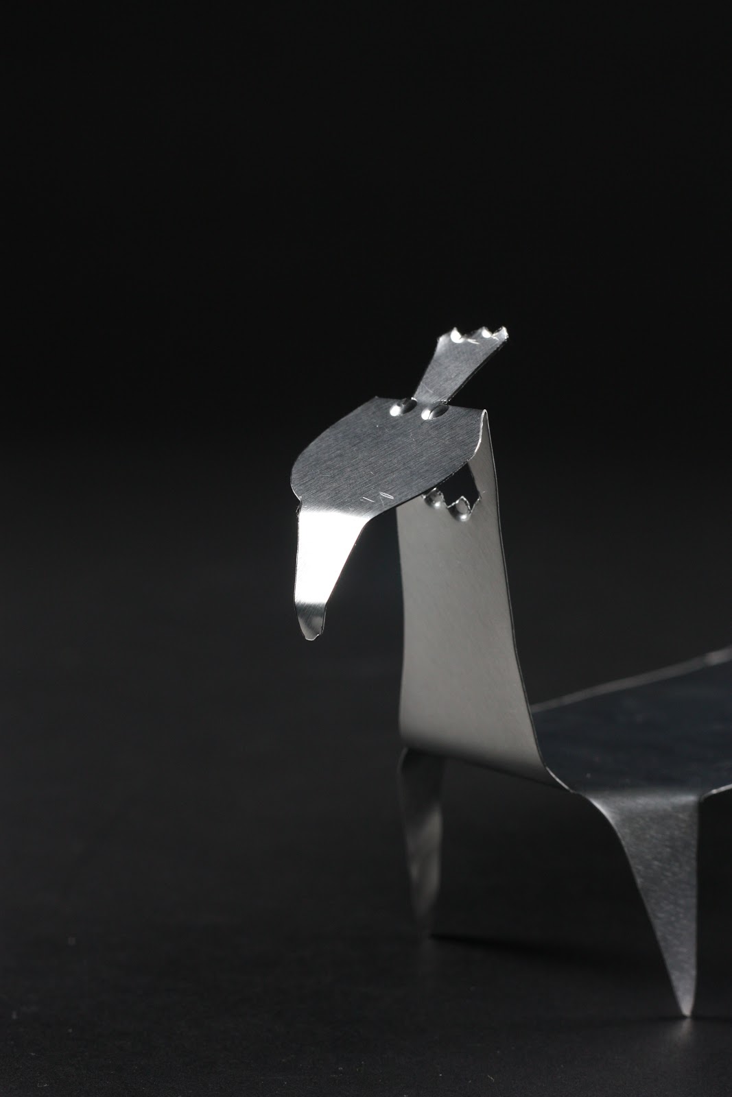
My favorite one wasn't required for the project, but I wanted to use a material that contrasted the form that it created, so I used floral cardstock in the last Eames Pig that I created.


Saturday, November 14, 2009
Design With Type I - Word Pairs
After weeks of submitting countless revisions, here's the final poster design for my Type I class. Each of us was given a set of word pairs that included an adjective and a noun. My pair was Powerful Moon. We expanded on the word pairs with simple visuals, eventually adding photos and supporting text.


Saturday, November 7, 2009
Storytelling - Escalating Desire
Each week in this class, we had to write a different story. of the entire semester, this story was my favorite. We could write about any character in any scenario, as long as they presented an escalating sense of desire. This is my story:
She's beautiful. Red paint, chrome edges, four tires that would make any who looked upon her swoon. There was never such a lawnmower as beautiful as her. I love her. I've loved her for weeks. Why not me? She notices all the others, each one, but passes by me weekly without a second glance.
She's coming? Out, in the sunlight, her paint glitters with excitement. I know this is her favorite time of day. It's mine too – another chance to see her! But today I will get her attention. Today, she'll notice me, want me, love me. She's getting closer. Left to right, now right to left. Each pass draws her closer. What do I do once she's here? How do I stand out? How do I get her to see me, finally, notice me? Left to right, there she goes again. I could stand taller. Risk it all, say hello. What if she doesn't hear me? But I'm up on this hill, higher than the rest, she must see me, at least! This time. Right to left. This is it. Left to right. Nearly there. I'm standing my tallest, I know she must see me now. I'm here, I'm yours, I've got everything you could ever want!
She's turning. Leaving once again. Next time perhaps. Next time she'll see me, tall, green, and strong. I'm the only blade of grass for her.
Saturday, October 31, 2009
Leadership in Creative Organizations - Vision Statements
This Leadership class has been one of the most useful courses that I've taken at Ringling College so far. We've done so much personal and professional exploration, so I wanted to share the overall philosophy I was able to achieve from these explorations. Like the successful companies we studied all semester, I created vision statements of my own to guide the goals I set down for myself for years to come:
Personal Vision Statement
My personal vision is to surround myself in ever-evolving beauty that will enrich my imagination and stretch my capacity for innovation. I will breathe life into those around me and find endless possibilities in each new day.Leadership Vision Statement
My leadership vision is to be the guiding force of energy among those who make the world a better place through their individual and collective creative explorations. I will help those without faith in their own work to see the possibilities that exist within art and the power that creativity has to change the world.
Saturday, October 24, 2009
Graphic Design I - Calendar
Calendar designs were extremely tedious. Not only did we develop numerous grid designs for the layout of the days of the week, but we also went through numerous revisions of the overall calendar theme and monthly visual content. I used the website wefeelfine to create a theme for my calendar, pulling quotes from their site in order to create a mood for each page.


Saturday, October 10, 2009
Intro to Web Design - Product Page
For this assignment, we each got to choose a product and create a new web site for it. I chose Reese's and used foil flowers that I used to create out of their wrappers as a guide in my design choices.


Saturday, September 26, 2009
Leadership in Creative Organizations - Life Aspirations
In one of my favorite projects for this class, we wrote detailed papers about our personal and professional aspirations. We were also able to create a piece of art (in my case, a painting) that helped to visually depict our aspirations.
I created my painting by taking an older painting that was an odd little family portrait and painting over it with more abstract representations of my life aspirations. The previous canvas:

And the final painting:

The final painting was done in a similar style to my triptych done last year. I created a collage of flowers and fabric and translated the collage onto the canvas, aligning certain elements with the existing painting on the canvas.
The paragraph accompanied my painting in the final project:
For this painting I chose to paint on top of an older canvas. This previous work was a representation of my family and how I viewed them in an exaggerated and colorful way. I chose to work on top of this painting because who I aspire to be is based on a foundation of who I am now and how I have come to be this way - predominantly influenced by my family and my upbringing. My life aspiration painting reflects my ambition to surround myself with beauty and engage those around me by enhancing their own appreciation for art. I hope that spreading my own knowledge of graphic design and its ability to influence our everyday decisions can show just how powerful and moving art can be.
Saturday, September 19, 2009
Graphic Design I - Icons
For this assignment, we chose an object to represent. We explored the different ways to depict a single item through photography, sketches, and vectors. I chose a measuring tape for my object and created vectors in Illustrator:


One of my final illustrations:

Saturday, April 18, 2009
Intro to AD - Humane Society
For our final project, my partner and I created a full campaign for the local Humane Society of Sarasota County - complete with logo, newspaper, print, and an alternative piece.


Saturday, April 11, 2009
Sequential Design - Water Awareness Posters
This project focused on water usage awareness in Sarasota and in the world. We created large-scale inflatables that showed the effect of overusing water on wildlife (pictures soon to come), a stop-motion video, and posters that promoted awareness and continued with our campaign theme.


Saturday, April 4, 2009
Image + Color - Semester Portfolio Cover
At the end of each semester in my GIC classes, we tend to create a printed portfolio of all the work we've done in the course. We got to play around with creating our own typeface for this project, which was pretty fun. I started with post-it notes, cut once and folded once. I photographed 3 x 3 squares of post-its until I chose a final composition:


I applied the image to my typeface options, which were originally sketched on a grid, and adjusted them in Photoshop on top of my final image:

Saturday, March 28, 2009
Intro to AD - Ringling Commercial
In one of our largest projects, I created a commercial for Ringling College with my partner. This was our script as we originally pitched it to our peers, the head of the AD department, and the head of the Digital Film department:


Next, we were assigned a small group of film students to help us storyboard, cast, film, and edit our final commercial. This spot went on to win a Silver ADDY!
Saturday, March 21, 2009
Image + Color - Filter This
This assignment was particularly tedious. We had to create our own Photoshop filters in real life. First, we photographed numerous subjects based on form, line, repetition, etc. We took those images, printed out our four final choices (grass, a stack of sktchbooks, a steal sculpture, and a carpeted wall), and covered them with any materials we could think of in order to affect the final image. Some of my alterations include: rubbing with sandpaper, scanning while lit from behind, crumpling the paper, and smearing with BBQ sauce. My four image choices:

And my final poster design:

Saturday, March 14, 2009
Exhibition - Big Box Show
My friend Danielle and I decided to put together a show of all the work we had created in the past year. The Crossley Gallery on campus was just too small because we both work on medium and large canvases, so we reserved the Exhibition Hall for a week instead.

The experience was really beneficial and I hope to curate more shows in the future.


The experience was really beneficial and I hope to curate more shows in the future.


We filled two small areas in the space with open submissions from other students from the Fine Arts department. The majority of the hall showcased our individual works.


These are some photos from the night of the show:

The painting on the left here was bought by the school and now hangs behind the desk at Student Life in the Student Center:


Subscribe to:
Comments (Atom)